Making video browsing easier for kids 6-9 so they can find what they enjoy most
User Research | User Experience Design | User Interface | Information Prioritization
Overview
Client
FreeTime Unlimited is an all-in-one subscription that gives kids access to thousands of kid-friendly books, movies, TV shows, educational apps, Audible books, and games on compatible Fire, Fire TV, Android, iOS and Kindle devices. Plus, kids can enjoy hundreds of hours of fun with ad-free radio stations and playlists.
My Role
- UX & UI Design
- User Research
- Stakeholder Management
Timeline
2 months
Platform
Android Fire Tablet
The Problem
Helping kids 6-9 discover video content they'll enjoy
Due to the large variety of content FreeTime has, my client suspected kids were having trouble finding the content they want. They wanted to improve their app's user experience so they've reached out to me to help identify the problem(s) and provide a solution.
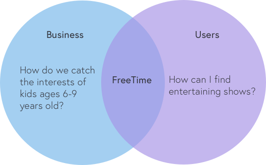
The Goal
- Increase app engagement with kids
- Helping kids identify the different types of media
- Provide kids with favorable video content upfront
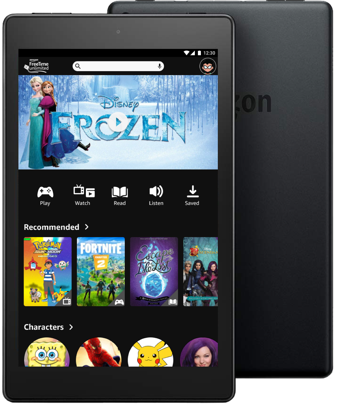
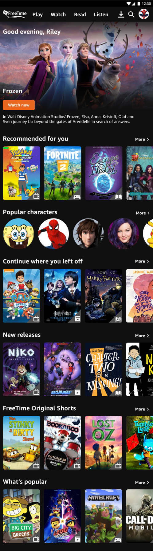
Final Deliverables
Bring up videos that matters most to viewers
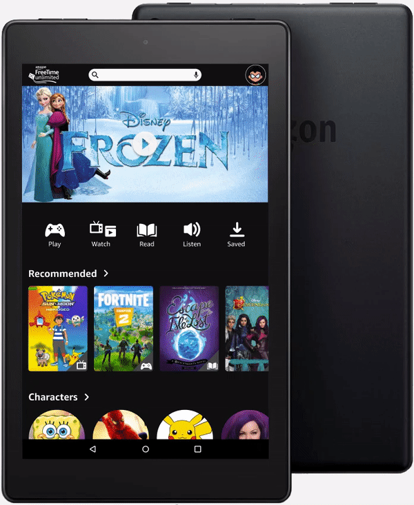
For the new home screen I’ve identified what were the most important categories that should be focused on to help kids discover new shows they would like at their fingertips.
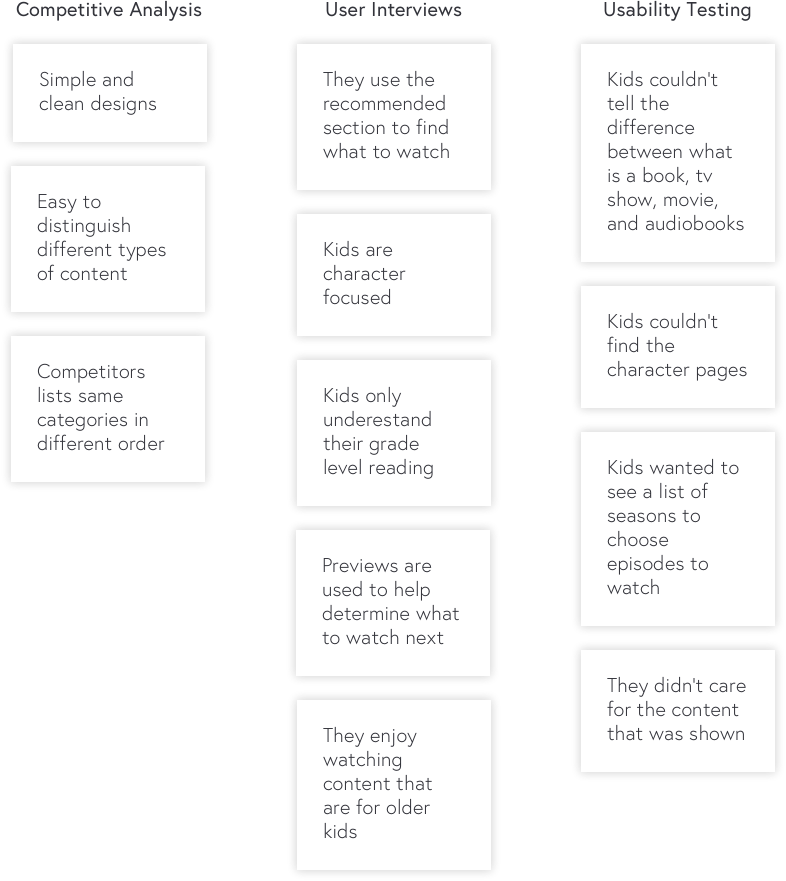
Discovery Research
Understanding what our research is telling us
Design
Putting together initial designs
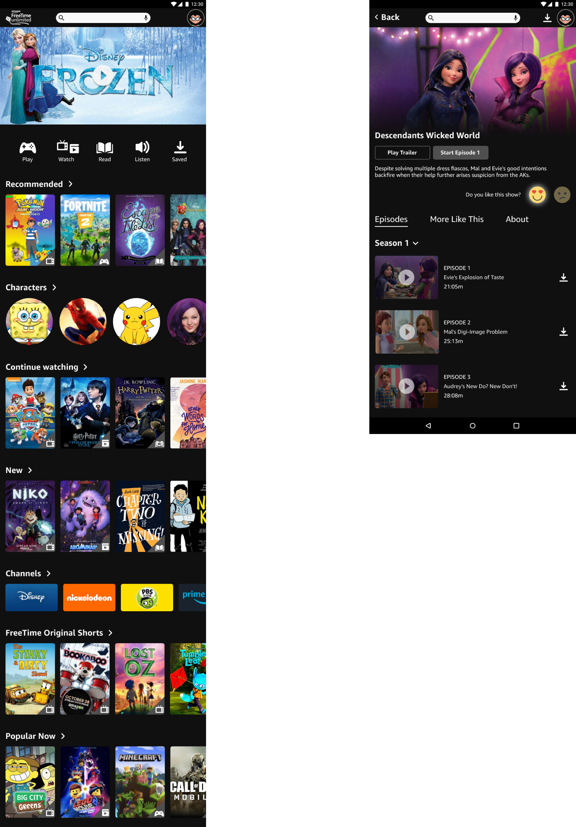
Tried to find different ways of laying out the content in a meaningful way and also include a like and dislike feature
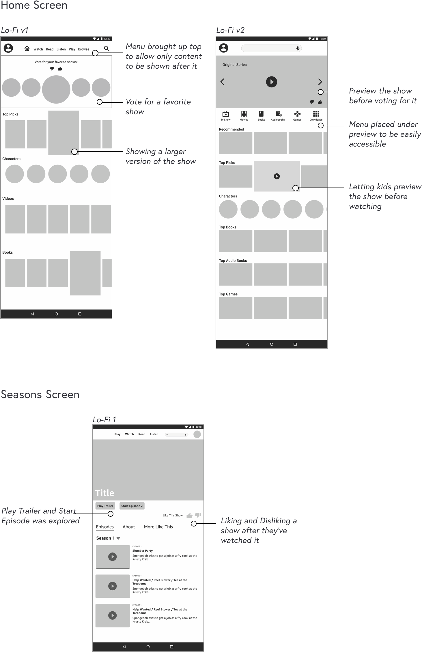
How did I ended up with these designs?
Making content images vertical was the most optimal solution because of the screen size constraint.
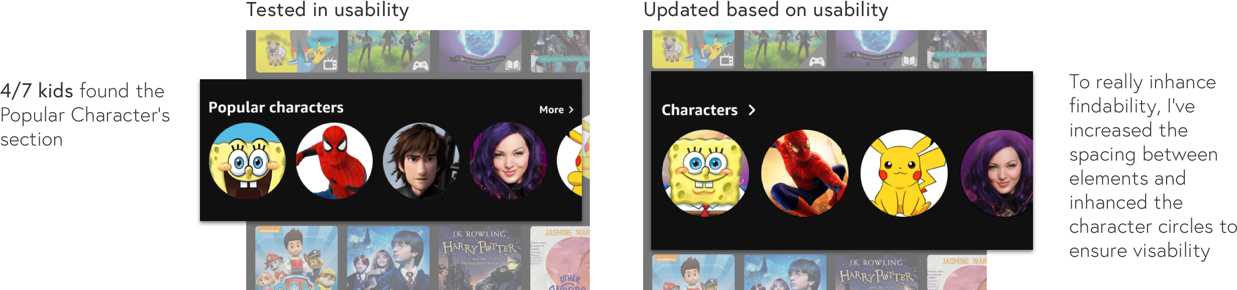
Character's circular containers were used to help users focused on the center of the content.
Based on the research, it suggests a few things:
- Kids like to watch previews of shows they think they might be interested in. Which is why the hero image iis there to show previews of new or recommended shows.
- They like to be recommended what to watch, so "Recommended" was brought up as the first row.
- They are really character focused.
Everything else helps bring up relevant content based on the ike & dislike and # of clicks algorithm.
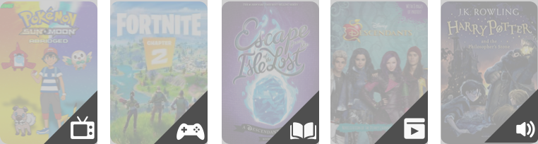
The icons were made to help kids identify the different types of media FreeTime offers.
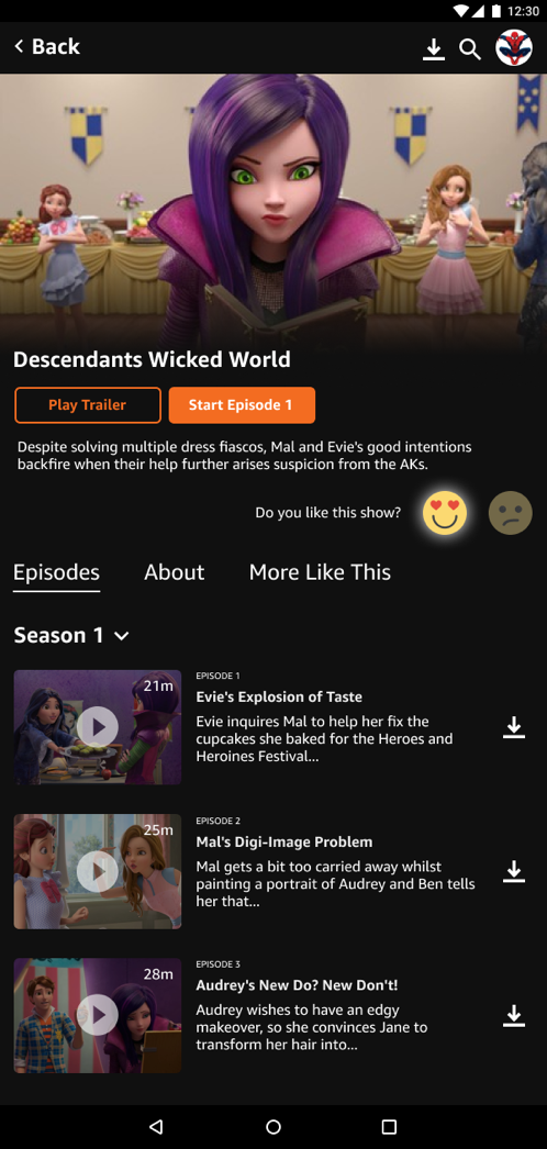
The like & dislike is best suited here on the Seasons screen. It made more sense to click like or dislike after kids have watched an episode or the whole show.
Smiley emojis were used because it mimics human emotions.
Usability Testing
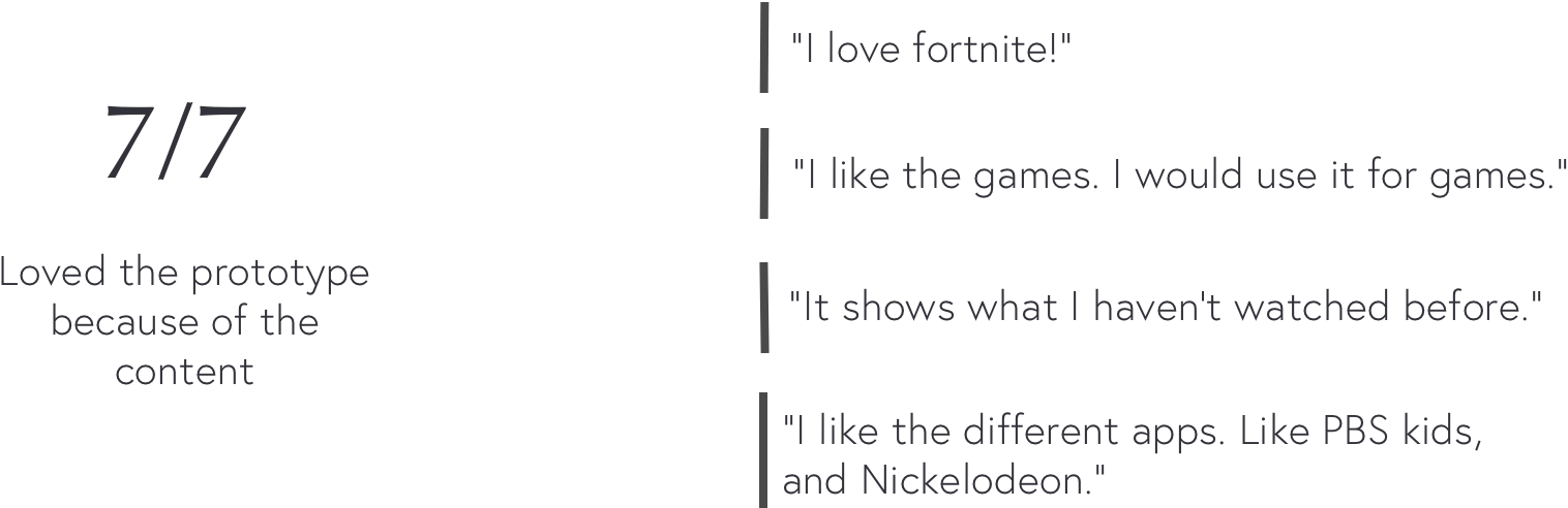
Kids are more attracted to the content that the app provides
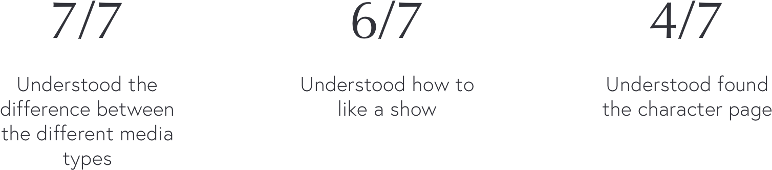
I validated with kids 6-9 years old to see if they could successfully find certain content I asked them to find.
What worked:
 Overall Impression:
Design Iteration
When it comes to looking at categories, kids wants visuals to help them out
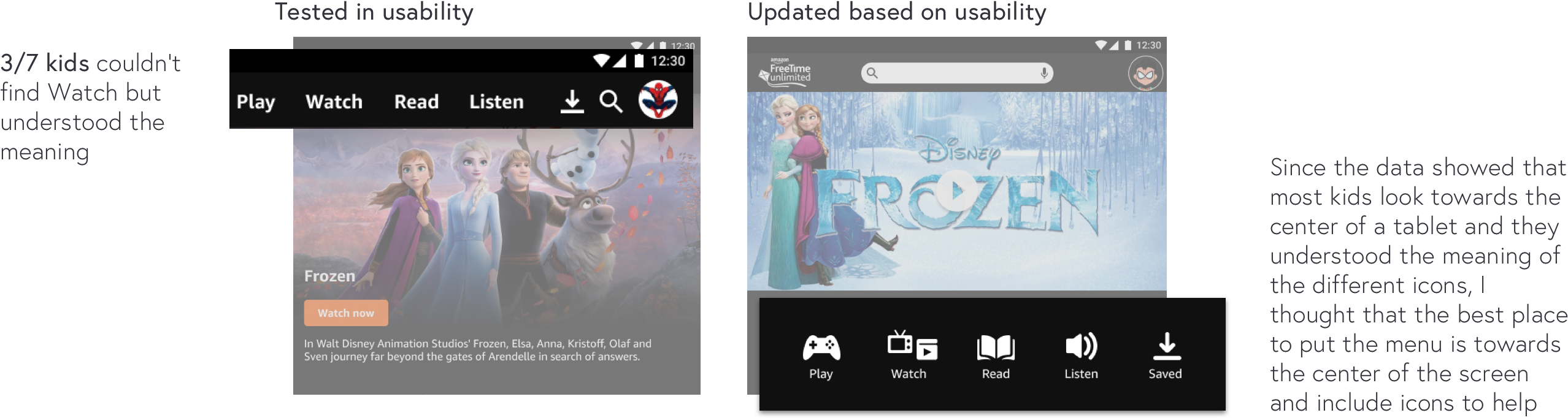
Characters was almost missed most of the time
Final Design
Reflection
Design is important, but content is just as important if not more
Kid’s mental capacity is wildly different from adults
Working with kids is very fun and exciting because of how different they think, but it is difficult to do user research with them because of their developmental stage. By reading about how to design for kids still didn’t prepare us with the ability to do usability studies right from the get go. The takeaway is, you can’t just read something and know, it is best to try it out yourself and learn what works and what doesn’t.
Love testing and iterating to refine the design more
If I have had more time, I love the opportunity to run more usability studies on the iterated version to make sure my new hypothesis about the “Watch category” and the “Character row” is correct. This time I would use the “pair” method. Letting pairs of kids use the app together will help me find more valuable information. I would love to make sure to solidify my designs based off of user research.